As always, there are a few rules that needs to be followed for proper judging, viewing and general fairness.
Competition Rules - All major parts of the entry must be original material, unless otherwise stated. Heavy references, sources and other visible influences should be credited as per normal forum courtesy. - Submissions must follow the current theme to be judged, and must be drawn for that theme specifically. You cannot submit something you drew prior to the theme being announced - Please do not post entries larger than 670 pixels in width. If your art is larger, post a thumbnail and link to the larger version. - Artists cannot win in subsequent rounds, but are allowed to enter said rounds. - Entries can be drawn in any medium available.
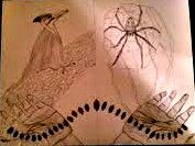
Oh. Well it worked, but you can't really see it well... I'm supposed to post a link then, right? I'm not really sure what to do. It should be clear in the link. But also really big...
I'll just point out I can't see your mail attachments, so post images either through photobucket, imageshack or deviantART (or flickr and facebook, if you have your profile set to that), and please to make an effort to make the image properly viewable. Cropping out irrelevant stuff and posting it in a proper size are some of the tips for that.
It is a competition, so making an effort should be included.
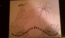
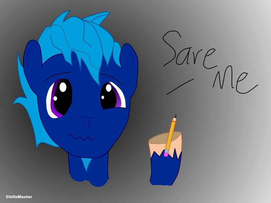
Soccerdude its a good thing that you can't post the same picture twice because that would acually be a rather good picture for fanart.Your entry in the first round.
Ah, good times, the old ASCs. Let's see if we can revive the old favourite for a new generation!
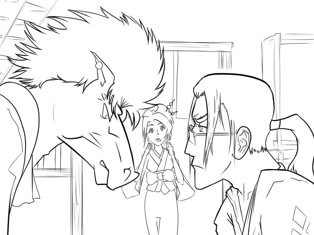
This is not yet finished, I have to tidy up the background lines and then obviously colour it. It's a Samurai Champloo crossover, therefore it qualifies for the theme.
Don't let me curb your enthusiasm, COME AT ME BROS!
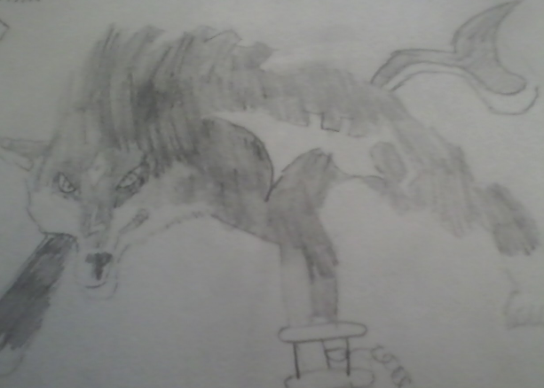
anybody here play the legend of zelda twilight princess? wolf link fanart.....had slighty better conditions for the picture to be taken,however it might be a little bit harder to see since it has been so lighty shaded.