Forums → Art, Music, and Writing → Art Skills Competition: Fire and Water (page 56)
| 565 | 233607 |
Welcome to the Art Skills Competition.
As always, there are a few rules that needs to be followed for proper judging, viewing and general fairness.
Competition Rules
- All major parts of the entry must be original material, unless otherwise stated. Heavy references, sources and other visible influences should be credited as per normal forum courtesy.
- Submissions must follow the current theme to be judged, and must be drawn for that theme specifically. You cannot submit something you drew prior to the theme being announced
- Please do not post entries larger than 670 pixels in width. If your art is larger, post a thumbnail and link to the larger version.
- Artists cannot win in subsequent rounds, but are allowed to enter said rounds.
- Entries can be drawn in any medium available.
- 565 Replies

The animation is really well made, but those horizontal lines on the sides destroy the perspective effect :P they should go all more or less in the same direction, and the space between each couple should decrease as you go higher their the picture.
Also I think I will post a picture tomorrow, too. You're welcome
thanks for the feedback gaboloth after looking at some photo's via google I can see what you are talking about
I'm going to assume the animation is the entry for the contest, weirdlike?
Heartened at seeing more entries, the decision to postpone judging by a few days seems to have been a good one.
Will be judging in approximately 24 hours!
ps. Just for the record, that alien is an artificially created species, so it's related to the theme Science Fiction Technology. It's not just some random sci-fi creature.
strop
If you accept the animation then sure if not the picture above it is fine
This thing could have had a much better effect if I used colours and/or proper lighting. Oh well.
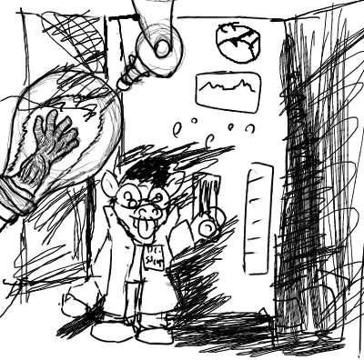
hahahaha mad scientists/doctors :P the thing is a regenertube, basically some sorta machine filled with liquid of unknown properties, super charge it with energy to spark activity to regrow/reconstruct lost body parts. And yaay had to draw the strop toon because its his theme hes judging
Oh my, so many entries and with such variety, this is most excellent.
I shall judge in 3 3/4 hours, hopefully by that point my WIP will also be at a stage suitable to be posted.
Here we are for another round of judging! After some encouragement, I was very pleased with the turnout, and the variety of the entries. It definitely made my job a lot harder, trying to figure out how much I valued certain things over other. Overall, the impression was what counted, that is to say, as in the brief, whether the picture gave me the vibe of "ooh, this is science fictioney".
For example, here's what I've been working on. It's very much a work in progress, but it has all the hallmarks of an archetypal science-fiction genre: anime mecha!
Adjudicator's Exhibit
This image is kinda HD large so I had to figure out where to put it first. Click it!
Also fulfilling many a user's desire for more Strip. Enough of that for now though, and moving onto another treat, from last round's winner! (I may have neglected to mention that my default rule is that the same user can't win twice in a row.)
Champion's Exhibit: Cenere
I will admit, as you can see from my demo, when I said "science fiction" I was thinking "futuristic". However, Cenere has gone and switched things up by referencing a true historical landmark in science fiction technology, the writing of Jules Verne. He accurately calculated the escape velocity of a projectile and modelled a cannon capable of launching a man to the moon. Thing is, since according to Newtonian physics, the escape velocity of a simple projectile, not accounting for friction of the atmosphere, is about 11km/s, that would have been one hell of a cannon (yes, I see that sonic boom in your picture, Cen, but... mach 35???).
Either way, this simplistic but incredibly artful nod to a legend of the past is a pleasant surprise, though one that comes to be expected from the likes of Cenere. Kudos!
Now for the judging itself, the moment many of you have doubtless been waiting for...
*drumroll*
First Place: Bronze
Also known as "I Can't Believe it's Not a Maghook!"
Believe it or not, the technology displayed in this picture is similar to a mainstay of action writer Matt Reily. It was generally used as a magnetic grappling hook, but on several occasions also used as a weapon.
Back to the image, the grainy black and white actually lends strength to the image, in emulating the science fiction action-horror films from the 50s-60s. I wouldn't be surprised if this appeared in a film entitled The Mutant Martian Menace or something, complete with a xenophobic (nationalistic) agenda celebrating the resilience of mankind and its propogation. Excellent creation of scene, and showcase of technology.
Second Place: Wierdlike
The critique that the perspective is a bit off rings true (might want to look up single point perspective), but the minimalist palette and the animation strongly conveys a slightly more modern science fiction feel, complete with flashing road lights (perhaps a form of automated guidance, one might speculate) and identical modular vehicles, very much in tune with the automotive concepts of the future.
Third Place: Goumas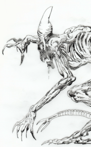
It was a difficult decision to make this the third place as opposed to the others, for Goumas' trademark style has proven very effective indeed in conjuring up this monstrosity scary enough to bring Sigourney Weaver out of retirement. I think my main issue was that despite the written qualifier, I could not see enough of the technology suggested in the image itself, perhaps the shapes appeared too organic. Supposing that I had seen, for example, articulated joints or visible implants or non-organic modifications, it would have been very much a different story. Nonetheless this is a truly powerful graphic.
Now, in no specific order, the section in which I note the notable characteristics of the remaining entries:
The "No Science Fiction is Complete Without a Mad Scientist" Award: HecticHermit
Dr Strep makes a rare appearance, delightfully caricatured with a facial expression not dissimilar to the mad mushrooms from Commander Keen IV: Goodbye Galaxy! I literally laughed when I saw it. Delightfully irreverent (again, much like Commander Keen IV), and something I kinda wish we actually literally had in this day and age, at least, if it worked, which, judging by Dr Strep's face, it might not. At least, not as intended...
The next two images I've grouped together because they both hold a nostalgic, temporal value to me:
The "Imaginary Cannon Phase" Award: light_chaser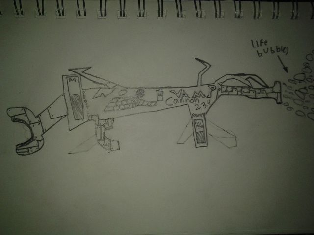
When I was a young colt (boy, whatever), I loved drawing guns. And cars. Basically crazy things with huge attachments and pipes and funny switches that fired all kinds of crazy things. They were big, bombastic and decorative. This picture reminds me of those days.
The "Schematic Cannon Phase" Award: thepunisher93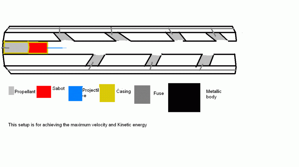
As I grew older, I turned my attention towards cutaways and schematics, trying to apply my rudimentary knowledge of technology to innovation. Perhaps it was a development of sorts, away from fanciful notions and towards real situations, or perhaps in reality, it was an attempt to maintain both. This picture reminds me of those days.
The "Oh, You" Award for Creating Something Entirely Impractical in Characteristic Manner: Kingryan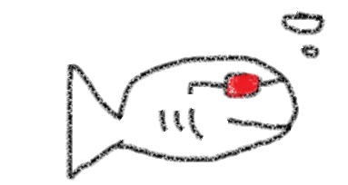
KingRyan never fails to think outside the box. This time he may possibly have outdone himself. If any of those X-ray glasses ever work, could you imagine just how much more chaotic this would make aquatic social life? Oh, the humanity!
The "Rave Party Trick" Award for Putting a Bit More Animated Technicolour in Our Life: Salvadian
Were the colours a bit brighter, I would have considered calling this the "Epileptic Fit" Award instead. Raaaaaave party!
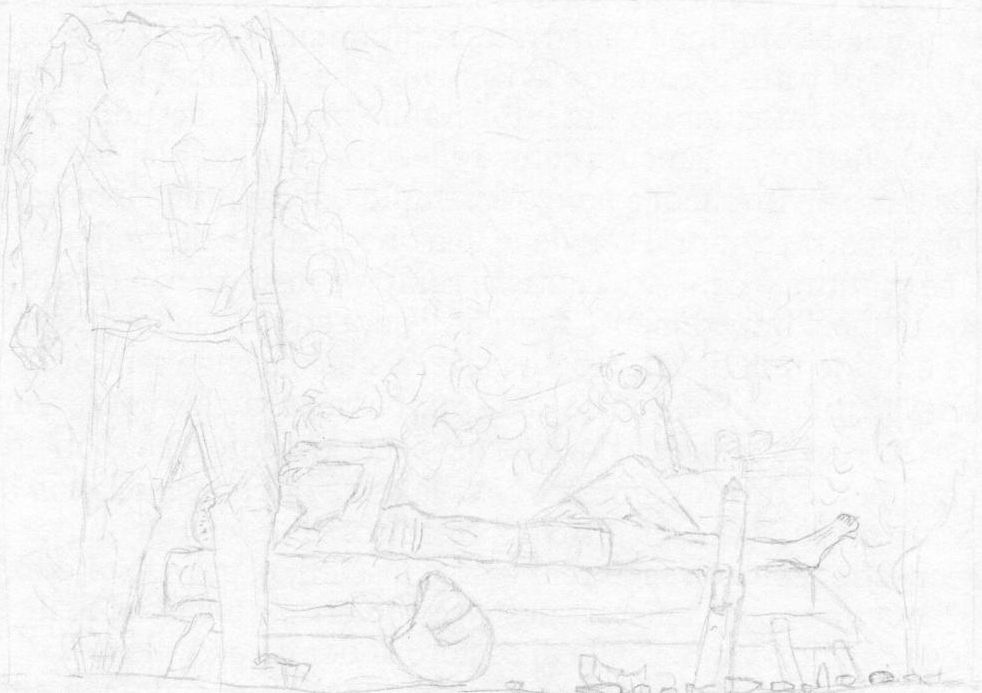
The "Technical Difficulties" Award: Gaboloth
I'm sorry Gaboloth, but due to the scan and paper I'm not entirely sure what's going on in this image. I think I can see a soldier and maybe another soldier lying down, and some kind of weapon propped up against a bed? You can adjust brightness and contrast, and more importantly, levels in a decent image editor, but if you're not using a scanner, the trick lies in getting the right amount of light on the paper, and well, that can be hard.
---
Alright, I'm going to start poking people again to step up and start judging, because I've started work and I should be studying, and also finishing the WoM. In the meantime however, we might as well get started with a new theme, and a sharp turn in a different direction altogether: Relief
This theme is based on a childhood memory of mine, back in elementary/primary school. One of our substitute teachers, a professional artist (man was he good with charcoals) asked us to draw a portrait of "relief"... based on a live subject, one of our classmates. Who did not have the foggiest as to how he was supposed to exhibit the facial expression of "relief", so our results turned out quite, well, not so well. The teacher then later spent the rest of the day doing his own version on a massive A2 piece of cardboard and it was bloody marvellous, but that's kind of beside the point. I want you to draw something that conveys "relief" to me. It doesn't have to be restricted to facial expression, or even animate beings. All I want to see is the fruits of your contemplation on "how do I communicate the notion of relief?"
Should I still be judging by the end of this round, I'll consider just how strongly the impression of "relief" reverberates from your submission. The trick is, that relief is actually a devilishly subtle thing to portray in its various guises, so that criteria is actually kind of a trick. I suspect you'll have difficulty if you focus solely on trying to hit the theme, without constructing a scene or a context.
Okay, good luck, your deadline is the 16th February, I will judge the following day as per usual.
lol, that was a scanned drawing, and I took some time fiddling with brightness and contrast too :P my scanner just hates my faint drawing style. Or vice-versa.
(yes, I see that sonic boom in your picture, Cen, but... mach 35???).
Don't doubt Jules Verne. Otherwise I will be drawing some Jorge Luis Borges next time. Or in the style of Giger.
@Gabaloth:
A matter of persistence and stubborness. That was twice a bunch of low brightness, high contrast. It might not look good, but it is visible.
Hmm, a fine time to have put away the scanner, it seems.
You must be logged in to post a reply!