Forums → Art, Music, and Writing → ~Art by Storm~
| 29 | 13960 |
I had an art thread once before but I stopped posting art there. I think it got locked because I stopped drawing for a while, so I decided to make a new one Doodling/sketching is two of the many things I love to do. My art has no topic, I will post random pictures.
*All Criticism Appreciated*
This is a hand dangling a spider by its web.
Please tell me what you think.
- 29 Replies

Logo of the book Fallen, by Lauren Kate.
Really good but it looks like you changed it a bit. Either that or I just cannot tell from the online pics of the book.
I have never heard of that kind of criticism but sure haha! Thats a good name. Thankyou ^-^
Yay art! I hope you keep posting more.
First one looks good. The far back finger looks oddly rectangular, you didn't have that problem anywhere else. The pinkie isn't showing, which is possible, but that would be a rather awkward and unnatural pose. The lines are big and bold, and I don't see many areas where they look sketchy.
You are doing a fine job recreating the cover. I think her rear end could be a little more robust, but just slighty. That would give you the curve of the back of the dress. Also in the back, the bottom portion of the dress connects to the middle portion in a different way than what shows up on the cover. But you might not be trying to perfectly replicate the cover, that's cool. My only suggestion then would be to clean up the line work, especially near the bottom of the dress.
I eye copied this wolf from my laptop. (Not a smart idea, it took long and I had bloodshot eyes afterwards as a consequence haha :/ ) Here is the link to the image http://images.nationalgeographic.com/wpf/media-live/photos/000/005/cache/grey-wolf_565_600x450.jpg.
Here is my drawing. 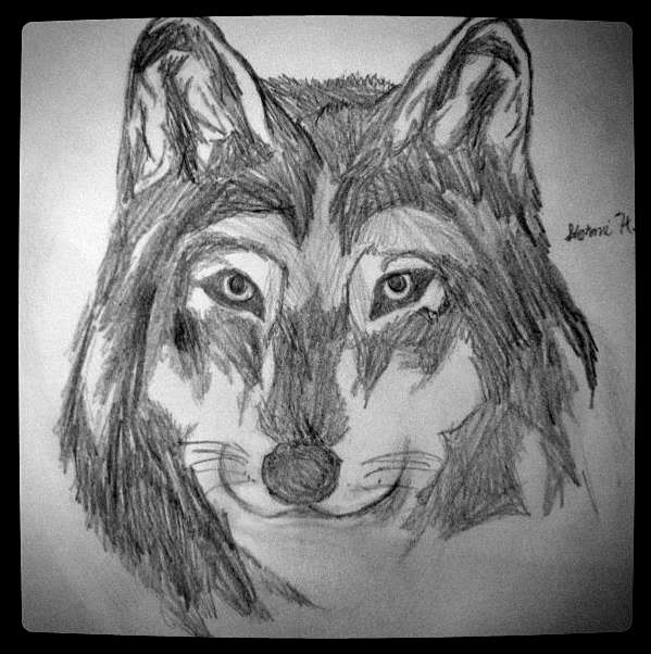
Ahh I see, thankyou Bronze ^-^
I apologize for the awkward border around the drawing I instagramed this images a couple months ago
My tip for wolves and other furry critters: pay close attention to the direction of the fur. A general rule for fur is the it flows from head to tail.
It looks like you hatched your pencil strokes on your wolf; that's the right technique. Just remember to check if your pencil strokes are flowing in the proper direction. That'll really give the impression of fur.
Keep up the good work.
Oo, I love the shading in the first one. Only a couple of anatomical things that kind of stick out for me, but it might just be the beginning of this all nighter I'm pulling. The thumb, for one, looks a tad too long for my tastes. The same goes for, judging by the depth given by the shading, what looks like the pinky. It looks about as long as the ring finger, though it looks like there was an end to the pinky, but then the extra space was also shaded in. Last thing, the skin under the the index finger at the knuckle doesn't seem to have enough girth in one area. When the shading begins, it looks like there is too much shaded area to give way to the inside of the hand that the thickness of the knuckle area is too diminished. Maybe I'm overanalyzing a hand, but what I thought. Other than that, like I said, I loved the shading, and the shape of the hand in general was awesome as well.
I agree with Bronze on the Fallen cover that the posterior needs some to it. A little bigger will give that nice curve. Also, I was sad when I saw less shading done for this one. Maybe you were going for a more basic element to give the drawing a feeling of having fallen from clarity, and if so, that's deep man, kudos. If not, I'd say the dress could use some minor shading to give a little bit of depth. Otherwise, nice recreation.
As for the wolf, the link you gave didn't work for me for some reason, so I;ll just base what I have to say on the drawing itself. Nice job with the shape coming out nicely, and I love the eyes. They make my soul howl (man I should go to bed, but nay I say!). The fur is pretty well done for my tastes, too, but it doesn't seem like the fur is fur, if you know what I mean. I can tell that they're individual hairs because of the strokes, but I can't see any direction with them. Very nice wolf head, and I hope to see more animals since they're awesome.
I love what you have hear and can't wait to see more. Oh and I suck at art, so these are just the musings of an outside observer, not much art talent knowledge to base it off of, just what I noticed.
Oh, and one more thing. Do you happen to have your old threads url? I'd love to see your old stuff as well.
Thankyou very much Dragonball05 . The link didnt work? hmm here is a second link. [url=http://images.nationalgeographic.com/wpf/media-live/photos/000/005/cache/grey-wolf_565_600x450.jpg]
Wolf Head
The picture comparison gives me another comment or two. I now understand some of the non-directional fur. This guy had a bit of beadhead, so it matches more to the picture. Also, well done around the eyes compared to the picture with the lighter fur. I would say that, even though you're only sketching, and not with multiple colors, the more tan color could be done a little lighter than the darker fur, as the contrast between that fur and the really light grey is enough to show there's something different at that darkness level. Unless you don't like the tan, which is fun, too :P
Also, I have been noticing that my tired rants have been containing some improper word choice. Hear instead of here? Gah, I guess sleep is important haha
I drew this almost 2 years ago. I saw this in a mythical creatures art book. I cannot remember the name of the book or the author of the book, but her first name was Sloan I think. ._. as if that is any help nevermind.
Anyways, this is a Chimera. Its a mythical creature half goat, snake and lion. I dont know much about the creatures powers but I know the goat is supposed to breathe fire and the snake, blind people. 
The picture comparison gives me another comment or two. I now understand some of the non-directional fur. This guy had a bit of beadhead, so it matches more to the picture. Also, well done around the eyes compared to the picture with the lighter fur. I would say that, even though you're only sketching, and not with multiple colors, the more tan color could be done a little lighter than the darker fur, as the contrast between that fur and the really light grey is enough to show there's something different at that darkness level. Unless you don't like the tan, which is fun, too :P
Also, I have been noticing that my tired rants have been containing some improper word choice. Hear instead of here? Gah, I guess sleep is important haha
Haha I got kind of lazy. No excuse though. Thanks and I am always up all night on the weekends. Except I'm usually doing something crazy and retarded with my friends. xP

The Chimera is very good, but er it isnt always interpreted like that. The way I have seen it is with a female lion head, a snake head for a tail and the fire breathing goat out of the shoulders. Yours is probably better than that... weird thing I described. didnt it have something to do with Hercules?
Nice art all around
I'm not sure how I missed this. You're obviously quite good at drawing.
As somebody who worked mainly in pencil sketches for several years (now I haven't done it for several years since I got a tablet...), if I may offer an advanced tip: when it comes to fur and feather textures, try to lighten your strokes and shading a little (this is not to say that the shade necessarily needs to be lighter in the end, but rather the process of shading itself). If your strokes are too dense and scribbly, the shading comes out all blocky, giving the picture a slightly clumsy look. It may take longer, especially as you'll need to rapidly stroke the pencil in the same direction (not an up and down scribble, as I can see in places), but you'll get much more lifelike results.
And where plumage/fur is light, you may be better off using implied line rather than explicitly drawing an outline where it meets another section (like over the owl's left eye).
Keep at it!
You must be logged in to post a reply!