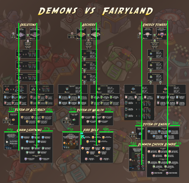
I posted the infograph already in a more game related section of the forum, but I would like to post it here to get the opinions on the artist value/functionality and overall quality of the infograph itself. I'm kind of looking for, do you think the layout is works? What do you think of the layout and it's flow? Does the layout make sense to you? Is it easy to understand and use? Do you think all the colors work well together? Comments on the background (the color gradient and buildings).
Obviously, it's a lot of images from the game itself. Those images were made by the artist who worked on the game. However, assembling this still took a very long time. I had to re-tool and make all the "nameplates", make arrows, and adjust certain things, re-type a lot of data in the proper font, and assemble the backgrounds, and also find a functional layout.
Just click on the image to get the full size version.
Not going to go in-depth because I should probably be doing my Calculus homework right now, but a few small things stand out that are bothersome: -It's a bit wordy for the space. Were the boxes larger, it'd be easier to take it all in. The biggest culprits seem to be the text next to the bluish icons under the Archers category, as well as the Totem of Energy category. -Could you lower the opacity on the background images a bit? Some of the images were somewhat distracting. -Some headings didn't look centered on top of the boxes. The headings along the top don't look bad, but the Fire Bolt and Summon Chovak Zombie headings are pretty bad (definition of bad: small problem, but obvious).
I was trying to line up the titles with the top title. So you see the vertical columns, the titles underneath are either supposed to be centered within the column or have an equal amount of text outside the column on the left and right. The numbers are the pixel count (in these unzoomed verisons) from the area where I am trying to center. It's not to far off, but it could be more accurate, I suppose.
Notice the Fire Bolt, the blue line indicates where I did not want the font to go over, yet I did want to stay centered within the vertical lines. It's hard to say what would be the proper centering. I see it in the current location as nearly correct, when zoomed out.
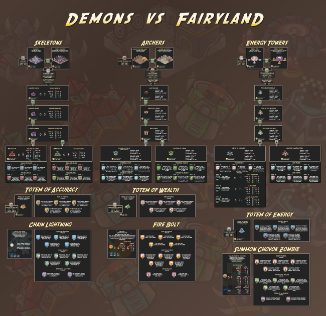
Here I re-align the Fire Bolt text and the Summon Chovok Zombies text. i don't know if this is the dircetion you were considering the centering of the Fire Bolt text, but it doesn't look right going the other direction either. Summon Chovok Zombies looks slightly more correct here.
I also toned down the background layer. It was only at 15% opacity before. Here it is at about 8%. I guess when I did the background I wanted it to go noticed, I was considering how distracting it would be, but I left it a little on the opaque side so it would be seen. It looks like slightly less opaque may have been the better option. But, I wish I could get more users input lol.
On a side note, if the image is supposed to be viewed zoomed in, this would mean that I should realign the text titles in a manner that would center them more correctly to their respective info boxes and not to the general alignment of all the titles within their columns.
Multiple words aside, the cramped-ness of the text, I would space them out more, but then so little is being seen within the viewing window of the screen, how useful is that, plus the image needs to be a reasonable size and it's already very large. I could have reworded some of the info, but it was difficult to convey some of that information in a more concise manner without losing clarity.
I now want to see more opinions haha. What do you think of the one I made changes to?