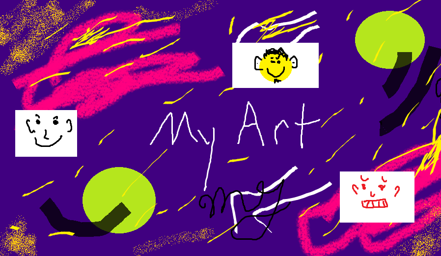
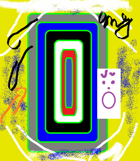
Well I'm new the art forum and I haven't posted much here before, but I'm going to post some of my own original art here now. I created the following using Microsoft Paint. Let me know what you think!
I really liked your sketches on page 3. I thought that they were well done. The machines you made were good but the perspective was a little off, but nothing a little practice wouldn't be able to fix. Your drawings on this page are a little abstract for me, but they do show that you have talent and technique with a marker. I would be interested in seeing a less abstract piece but utilizing the techniques you seem to have. I think it would come out well.
I really liked your sketches on page 3. I thought that they were well done. The machines you made were good but the perspective was a little off, but nothing a little practice wouldn't be able to fix. Your drawings on this page are a little abstract for me, but they do show that you have talent and technique with a marker. I would be interested in seeing a less abstract piece but utilizing the techniques you seem to have. I think it would come out well.
That's what's I'm talking about!, Now that is some constructive criticism! Very nice Mr. daleks! Your message is well composed and very helpful. Thank you for your feedback.
Did i said something to you? since i have no problems with you im just telling this to all in general for them to know i dont even know what you did or not here , i just saw a bit of fight and all
That second one on the last page reminds me a bit of the dot game people play on napkins in restaurants. I'm not the only one, am I, who is aware that this game exists?
Creating art just for the sake of making something "retty" is just as good a reason as any other. Keep doing what you enjoy. It's really hard to critique your non-objective art. I guess the biggest thing with that style is line variation. Work in as many different widths and lengths as you can. It makes for a much more visually satisfying piece.
Some other important variables to consider are your weight and flow. Try leading your viewers with your lines. Play with moving your focus. What area do I want to be the dominant? Do I put more lines in on this side? Will it be symmetrical or asymmetrical? Those are just common questions to ask yourself before you put pencil to paper.
On a different note, I think pang had a good point about actually trying to convey an idea with your work. It's much more interesting to see how an artist interprets their ideas to paper, and it actually leaves room for that beautiful phrase, CONSTRUCTIVE CRITICISM. But like I said, do what you like. If you wanna doodle pretty pictures and stay mired in the uncreative land of chaotic abstract art, go ahead.
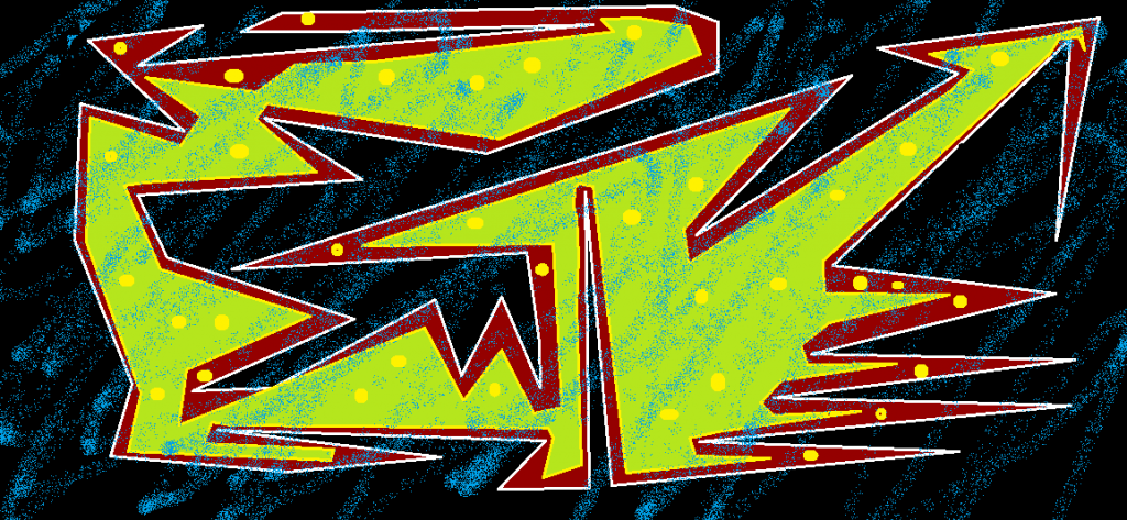
I like the combination of the dark red and the light green. Not sure how I feel about the yellow dots.
The dots are meant to break up the linear feel from all of those lines. More features mean more depth. Although they may not be the best choice, I feel that I need to add more things like that to my art to make it pop out. Any suggestions for additional depth and effect?
I think the blue spray-paint overlay detracts more than it adds to the depth. Perhaps if it were behind the subject it would have more the desired effect, although I can't help thinking that the spray-paint function is out of place no matter how it is used.
Yeah, I see what you mean. Hum. Perhaps it wouldn't appear that way if I chose I spray color that was very close to the other colors in the picture? Anyway, I like your idea of putting the spray behind the subject is the best idea. It shouldn't draw attention away from the subject if I can pull it of mastafully.