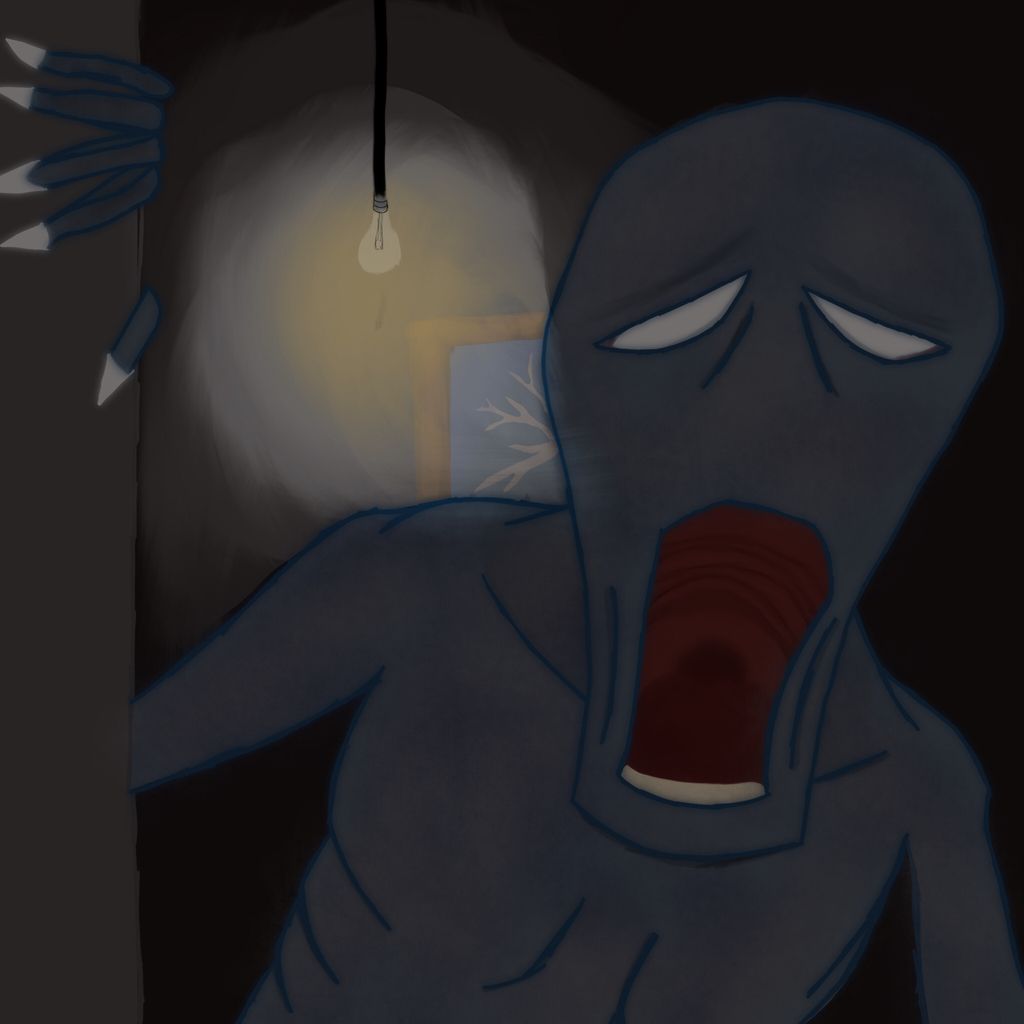
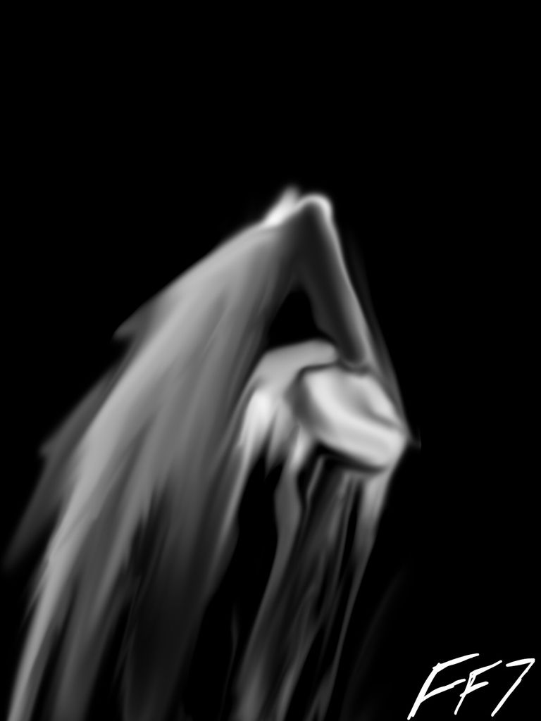
1 The fingers don't look right. They need to be curved and perhaps even a bit knobby at the joints.
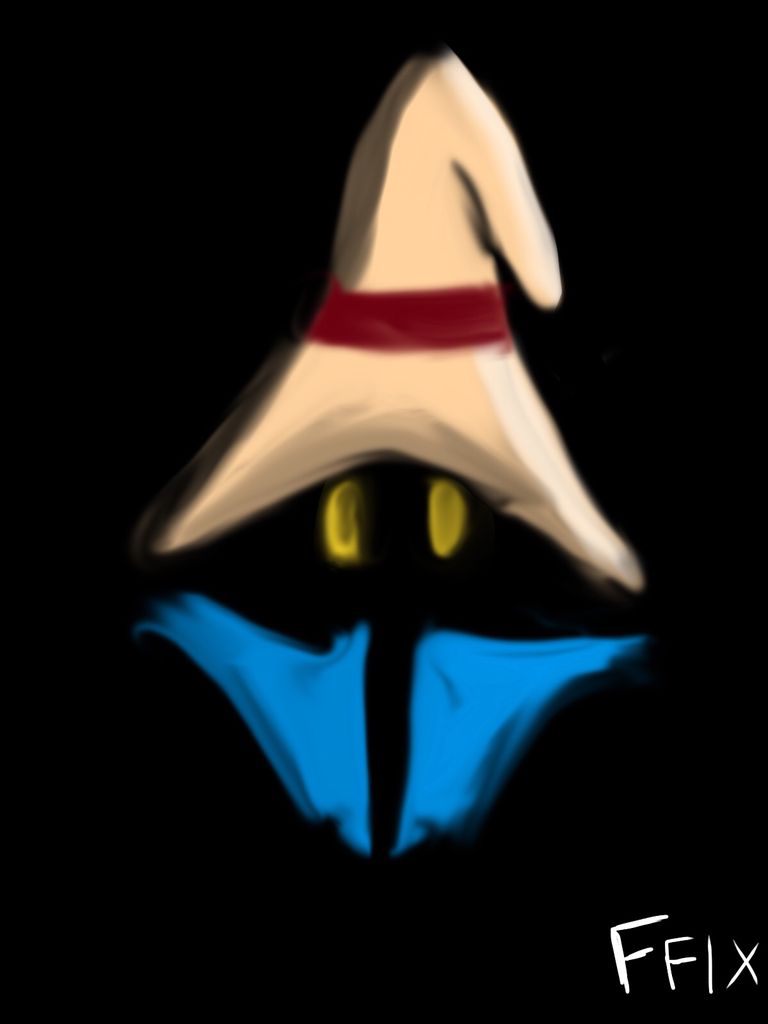
2 Some part of the floor of the mouth should be visible at the line of sight depicted here. If whatever it is has a tongue, it should occupy most of that dark space.
What do ya'll think I could do to improve my work?
Make the eyes more glowy, have a misty/glowy trail behind him...Iam assuming its a ghost. Make it a little more transparent if it is, if its some sorta monster it needs sharper teeth :P
Cool concept, but there are some technical flaws with it.
It looks like the light source is behind the monster, which means that it would be mostly a silhouette with maybe a little light shining on the very edges of the upper left side.
The light coming off the lightbulb is also very choppy. If you lower the opacity til it's barely visible and layer white/yellow (whatever color is coming off the bulb) enough then you can get a better gradient effect.
The blue outlines on the monster are a bit harsh, you could fix that by making them thinner or creating the gradient effect and adding some shadows.
The mouth would be completely black if the light source is from behind, I know you want to show the tongue and whatnot but it's not very realistic.
The monster should be darker than the room which is supposedly illuminated behind him.
Depending on what program you're using, you should be able to sketch everything out before beginning to draw, using a low opacity so you can see the guidelines and fill them in and avoid harsh or wobbly lines. I personally use photoshop and illustrator so I don't know if other programs allow you to make layers but i usually use the pencil tool and lightly sketch things before moving to another layer and beginning to color in on top of that.
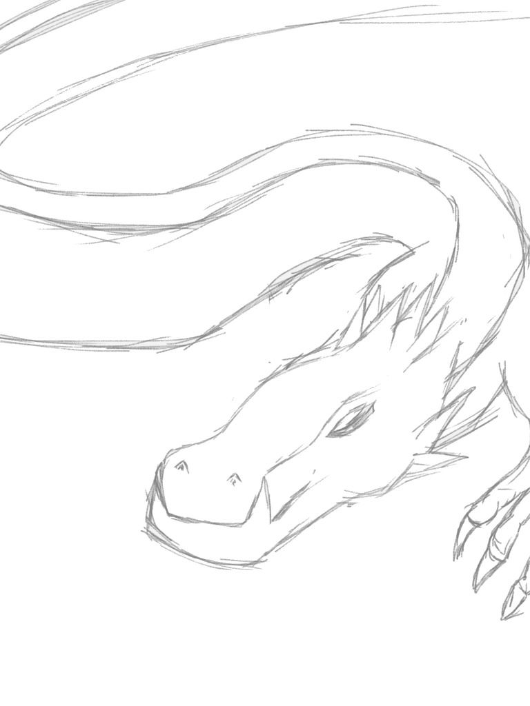
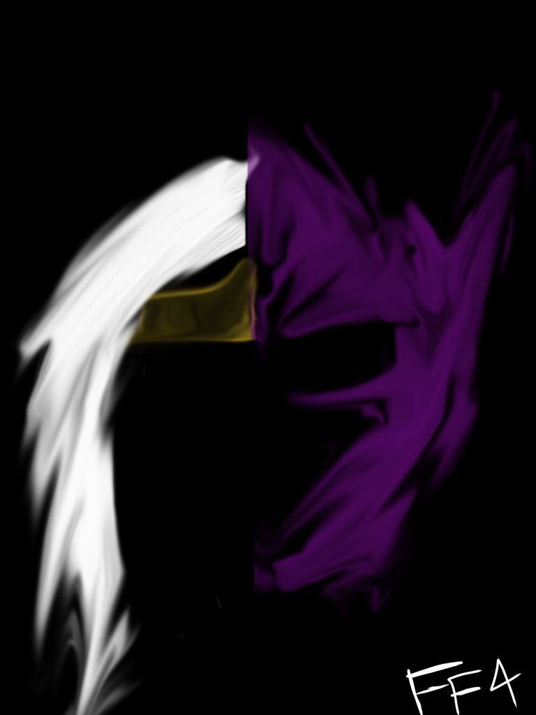
I don't know if this is helpful, but words are a bit hard to come by currently: An attempt.
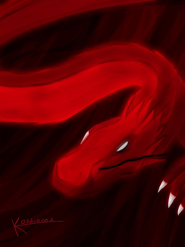
Basically, you can "cheat" by adding a secondary light source. Especially - ambient light, which won't be very strong, but will help define features of what you are drawing.
Making the colour darker near the highlights also help to both give a sense of darkness, as well as definition.
The multiply- and screen-settings at various opacities are good to play with to add a little something, be it colour to the shadows to continue with the ambient light, or to simply add the light and add some colour.
Wow, @Cenere, that took to a whole different level! Thanks, for the advice, I am working on a different drawing, incorporating the advice I have recieved. I'll upload it here when I am done.