Forums → Art, Music, and Writing → Creating Art: Tips / Tricks / Troubleshooting
| 12 | 8525 |
![]()
![]()
![]()
![]()


![]()
![]()
![]()
![]()
![]()

![]()
![]()


![]()
![]()
A lot of users on Armor Games have created some awesome art work for a wide variety of projects over the years. The Armor Games' Armatar Contests, the ASC - Art Skills Competition, their own Flash Games (to name a few) or simply because they want to experess their creativity...
In order to make such wonderful works of art, many use the known art programs that are freely available, to whatever's their liking. A lot of those are free to download, or come standard with the purchase of a computer or laptop. Everyone has their preference, or simply stuck with a program their liked to work with. Some examples of these programs are:
![]() - PAINT (formerly known as 'Microsoft PaintBrush')
- PAINT (formerly known as 'Microsoft PaintBrush')
![]() - GIMP
- GIMP
![]() - KRITA
- KRITA
Where some have perfected their skills on working with such art programs, there are others that want to start expressing their creativity for the first time, or perhaps they bump into problems while working with these programs for a while already. Whether you're a beginning artist, a novice creator, or an expert proffesional... that's where this thread comes in!
Share all your tips, tricks, easy ways of creating, ideas and problems in this thread and let the Armor Games Community benefit from them or -when in need- help you out by solving your problem! The more others will learn, the more we can all express our creative minds and make awesome works of art!
Be creative! Amaze us all!!
....................................................................................
General Advise and Help :
~ Experiment! Try out anything you want, in any way possible, in any color and at any size! You never need to share it with others, but it will most certainly boost your creative skills! Practise makes perfect after all and you can never learn something you haven't tried out...
~ Listen, watch, ask and learn! Search for helpful videos on making art, read about tips and tricks (this thread for example?) and ask questions... Many artists are willing to share their experiences with you, so use that to your own benefit and grow!
~ Don't be afraid of (negative) feedback; use it! Many beginning artists will hesitate to share their work publicly due to low self esteem, simply because their work may be criticized heavily. This can always -and most of the time will- happen, but... instead of pouting and quitting, use this feedback to your advantage!! Learn from your mistakes (if any), try out a new approach, or simply stick to your chosen path and perfect your way of working. It's all up to you... just remember to always know that what you create is unique and those that are shouting how bad/awful/ugly it is, probably don't even know what a pencil looks like!
~ Get out of that box!!! A lot of artists are following pre-defined paths that were paved before them by other artists in the past. There's nothing wrong with that, one can only learn and benefit from it! But... why not be bold and take a side-step? Think out of the box! Try out weird new things, walk down the lonely road and become even more unique with a signature of your own. Don't push too hard at trying to become unique, because that's unnecessary... you already are!
Programs / Digital Art
~ Try out a program's features! Most programs have a lot of features ready for you to use and abuse! Learn how to (ab)use them and master them completely to come up with loads of new ideas and/or ways to create the image of your thoughts!
~ Going digital? Go for a pen tablet! Maybe a little awkward at first, but with a far lower difficulty curve compared to using a mouse. The distance between the point of drawing and your hand holding the pencil is almost zero, especially compared to the greater distance the position of the mouse has compared to the screen you're watching. Hand-eye-coordination is key for some people...
....................................................................................
List of Tips / Tricks / Troubleshooting :
► Pixels - Image Sharpness : How to draw smoother lines and shapes.
....................................................................................
Note: This OP will be updated with links to useful posts and ideas when needed, so be sure to keep checking it out for new items, tips or problem fixes!
Credits : @Hectichermit @nichodemus
- 12 Replies
Since @GoodyPundit wants to kindly share his knowledge on how he makes art for his games, let's call him out here to help others learn!
I am not the best artist around here but I will openly share what I have learned.
1. If you can I would suggest using a pen tablet for digital art, it may be a little awkward at first but the difficulty curve is far lower than using a mouse.
2. Draw anything, doodle anything you do not have to share it but I think with anything the more you do it the better you will get.
3. Learn some concepts and try to apply them. Things like color and perspective have alot of information out there.
4. Watch other artist, there are plenty of videos out there of artist, find ones that go into detail as they draw and explain what they are doing. If anything else you can always ask them some questions. I am sure many artists wouldn't mind telling you about their art.
Anyways goodluck with this MrDayCee can I also suggest Krita for the list o free programs.
My own two cents worth - At least spend some time doodling the good old fashioned way with a pencil and eraser, before going digital. Not such a prudent format for Armatar contests though, was a pain in the neck if your scanner/camera aren't up to the task. Reduced the quality and detail of my drawings a notch at least.
I believe Photoshop CS2 is free to download, and it beats Gimp and Paint outright for me. At least, it was free last year.
@Hectichermit Thanx for the pointers and the program suggestion! I never heard of it before, but it seems rather new, right?
@nichodemus I checked and the problem with PhotoShop CS2 is that it seems free, but you still need a license key. It was released for free download, but apparently only people who previously bought PhotoShop and already have a key for that program can use it... I'd rather not add it to the list as it may be confusing about whether or not it is a free program. Once it is, we can add it of course!
Oh the license key thing! I never did register it. I just skip the registration phase whenever I use it, and I still have full functionality over it. They released it as a legacy version. Though if someone wants to test it out again, that would be good.
That's often the entire problem @nichodemus, but it would be great if someone would indeed tell us about it if they tested that! Some programs loose a good chunk of operability when not registering and simply skipping that part, so... test someone? Please?
PIXELS - IMAGE SHARPNESS
(Program used: Paint)
When creating art with Paint, you often bump into the known problem of ending up with a heavy pixelated image as a result. When you use other programs, it might be using vector (which is a better resolution), but when you start drawing in Paint, this annoying problem can be solved quite easily...
As an example, I've drawn a circle, a diagonal line, a diamond shape and a swirly line to explain...
I've started out with a field sized 250 x 250 pixels and created the shapes: Example 1. As you can see, the shapes are all heavy pixelated as a result. (Note: I've blown up the image a bit to clearly show the differences in methods)
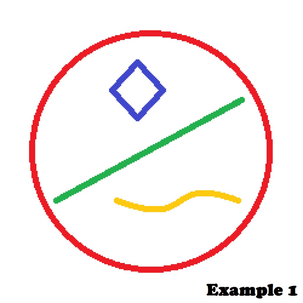
Because of the small field you started out with, the bigger you zoom in on the image, the bigger the pixels become and the more blurry your drawing becomes as well...
To solve this, there's a simple rule to follow: Start with a bigger field, then scale down!
To show the difference, I've created a second example, where I started out with a much bigger field of 1000 x 1000 pixels, shown in Example 2. I then zoomed out once ( using " Ctrl " and " - " ) in the program, to make the field visually smaller and easier to draw in.
Because the size of the field is now 4 times as big as the first one, the pixels are higher in density and thus make all the lines you draw much smoother.
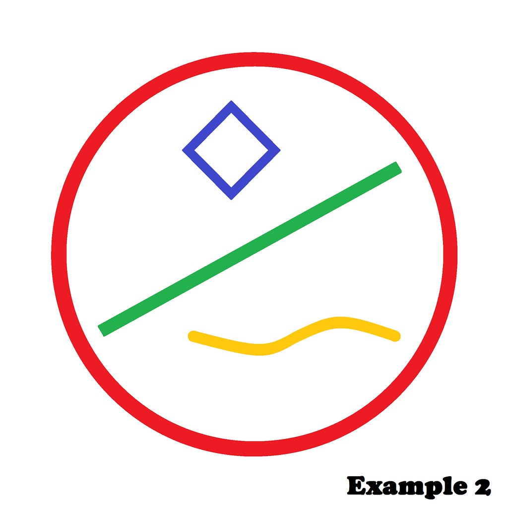
Once you're finished, it is always easier to scale down an image, than to blow up an image. Scaling down will keep a better resolution, as where blowing up will result in loss of resolution.
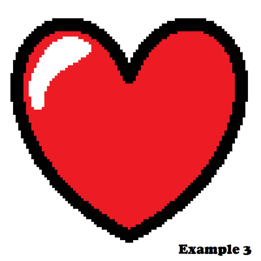
To give another example, I've drawn a heart shape on a 100 x 100 pixels field to start, which will result into this (Example 3) when blown up to a field size of 1000 x 1000 pixels; extremely rough edges and blurry lines.
(Note: some artists have perfected pixel art and will draw this way on purpose. This is your own choice of course...)
If you start out with a much larger field of 1000 x 1000 pixels and draw a heart, the lines will become smoother because you're drawing on a field 10 times the size of the former one with 10 times the amount of pixels on the same area: Example 4.
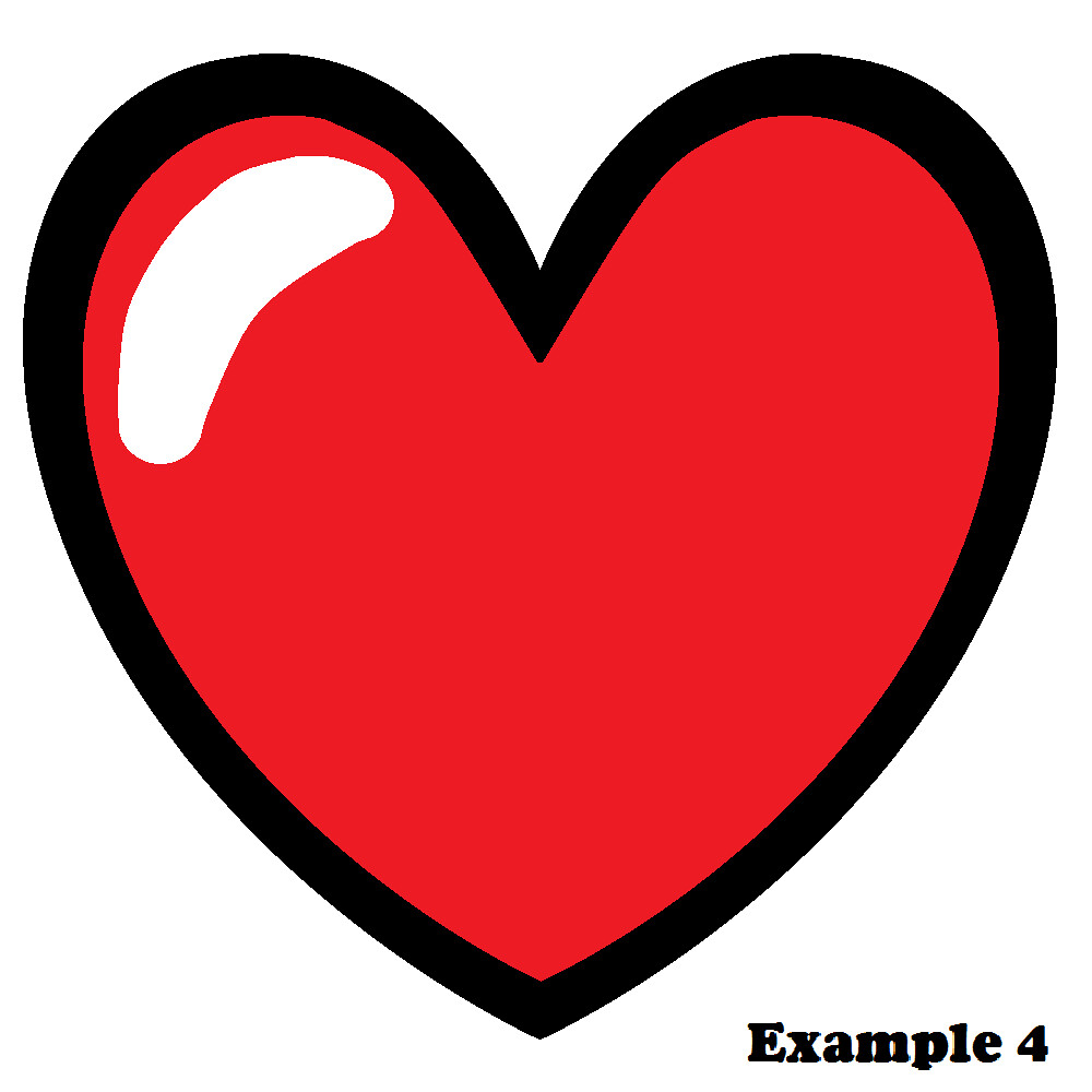
I hope this is an easy trick you can benefit from while making your awesome creative art work!
Ok. This is going to be a little long. I will be talking about drawing because that's my forte. Will break into several posts because I’m not done writing and it already takes up 3 pages in MS word so far.
PART ONE: GRAPHITE AND CHARCOAL PORTRAIT DRAWINGS
As most of you who frequent this forum know, I have an art thread . I've been posting in it with relative consistency for the past four or so years. Some of you who have been around for that long have seen me grow as an artist, never really changing my style, but definitely changing the way I go about approaching certain aspects of my drawings and becoming better at drawing what I am actually seeing.
I've always loved drawing, and I've been doing it for as long as I can remember. Most of the time it was stuff like this:


Not absolutely awful, but nowhere near realistic. Realism is always what I've gone for when it comes to drawing, and I would try very hard to make my art look realistic, but I had no idea what I was doing.
One year, probably 2011 or 2012, I got this book for Christmas. I pored over it, practicing the things it taught me about gridding and shading and I practiced and practiced for what felt like forever.
Seriously. Remember what my art used to look like? Well I started doing a self-portrait first. I held up a hand mirror and practiced everything I learned from the book, quickly learning that the gridding process wasn't for me. Then I moved on to working on drawings of my friends using their Facebook profile pictures. This was the result:

This was my self-portrait. Obviously it's a little skewed, but the shading is there and it usually wasn't in most of my drawings, and if it was there, it was horribly sloppy.

Better than the self-portrait. The more you practice the more you'll improve. At this point, I started using the relative distance between features to help me draw accurately. I would look at how big his mouth was, and then figure out based off of that where the bottom of the nose should start. Then I'd draw the nose, and judge from its size where the corners of the eyes should be, etc. This is how I've always drawn since. It's not for everybody though.

This is another drawing of a friend, it's still not perfect, lacking in some shading, but it's my first one with teeth showing. If you're going to practice, practice with different genders, skin colors, hair colors, etc. You don't want to be stuck only able to draw one type of human being.

I did another self-portrait after I'd practiced, and this one is obviously more realistic and proportionate.
So that's the process I went through to get the basics of drawing humans realistically down. These were all done in charcoal and graphite.
Now on to the tools I used.
I did this on very poor quality paper. I know you may think "oh, I'm not very good yet, let me get a dollar store sketchbook to practice on before i get a good sketchbook."
No. Don't do that. Invest in good paper. It makes a huge difference in the way that pencil lays on the paper, the intensity of it (the darkness), the way it blends, etc. It's very important. Also invest in some actual drawing pencils. Staedler and Faber-castell are good brands. Prismacolor pencils are ideal and they are what I use now, but they are very expensive, and I would only recommend them if you think you’ve surpassed the “beginner” and “intermediate” level because with how much these products cost, you don’t want to be constantly erasing and redrawing with them. Speaking of erasing, good erasers are also important. There's these squishy grey erasers called kneadable rubber erasers which are great for forming into tiny points and then you can use them to dab at the paper and lift very small highlights. A normal rubber eraser is good to have as well.
Next, for blending, you need to get tortillions. I'm almost positive that those of you who blend and don't use these either use your fingers or tissue paper. Stop using your fingers. This gets oil on the paper, and when you blend, the little bits of pencil will stick on the oil and it will make darker spots, irregular shading, and it's just bad. Tortillions are pieces of tightly rolled paper that you hold like a pencil or however you want, and you use the pointed tip to blend the pencil so it becomes more gradient. You can use just the tip for small areas, or hold it so the whole side of the tip is lying flat and use that for bigger spaces.
Pencils, paper, erasers, tortillions. That's all I use for portraits, usually.
At this point, several years later, after about 6 hours my portraits can look like this drawing I did of my fiancé, David, as my final in my college drawing class:

It used to be that I'd spend 8 hours on a portrait (see those above) and they would look nothing like this. Like I said. Practice.
And a short, 2 hour drawing looks like this:

So even if you aren't great now, just keep practicing. That's all I did.
ON TO COLORED PENCILS!
I'm just going to post a couple of pictures and explain the blending process because that's important in making realistic colored pencil drawings.
I always set up by finding a good few reference photos and then lightly sketching out the drawing. I cannot stress this enough. If you press too hard or use too dark of a pencil, it will mix with the waxy lead of the colored pencil and muddy the color. So use a pencil labeled 2H or so since it won't go down black.
Alright, pictures:


I was going to post more, but then I realized the rest of my colored pencil drawings showed certain aspects of the human body that I can't post on here.
So basically, with colored pencil, it's important to pick out all your colors first. Lay them out together in an easy to reach place, and make sure to have a pencil sharpener nearby to use ONLY for the colored pencils. The wax from the lead can make it hard to sharpen normal pencils after using it on colored pencils.
I usually pick my base colors first when I'm choosing what colors to use. For the raven, I used a bunch of different shades of grey. You might be able to see different colors throughout the body. That's because instead of using white as the highlight colors, I used blues, greens, and purples. It looks a lot better in the sunlight, where the colors can really show: 
How I blend my colored pencils is I lay down the layer of base color, so maybe a midtone of grey, and then after I have an opaque and thick layer of that, I pick a slightly darker and lighter grey and use those over the base and build up the dimension by layering and going over it until it looks smoothly blended. Then, for the raven, I used a very sharp black colored pencil to make the markings to make the blocks of color i colored in look like feathers, and then used very sharp purple, green, and blue colored pencils to bring in a little bit of color and make the feathers look more ravenlike. Like the way an oil spill looks on asphalt after the rain.
Pretty simple really. I used prismacolor colored pencils for this. I recommend starting with prismacolor scholar pencils as they are not horribly expensive but are still good quality and you can get used to working with them before buying prismacolor premier colored pencils which happen to be very expensive if bought in a store. I think mine were about $300 USD.
I have some pictures of the process which I'll dump below:


If I can get a working camera that isn't my phone, I may eventually record a tutorial of sorts. But this is all I have for you right now
Note: Don't listen to "You're a special individual and everything you do is perfect if you believe in yourself."Quite right.
There is no such thing as positive criticism. If all Matt got in response to his drawing was "Wow, that's amazing. Keep it up!", he might never notice how that line makes his 'after' example's hair look like an old wig that's starting to come apart at the edges. Or that the ear is well below the jawline for some reason... and the right leg is distinctly longer than the left. These are things that can easily evade an artist's notice if they aren't specifically looking for them, so it's always good to have someone who can give you an unbiased critique.
Oh, and the left shoulder sticks out as though it's been dislocated or something.
So there's a free alternative to Illustrator called Inkscape. It's used to make vector images. The thing with vector images is that the computer actually saves the drawing data as paths or lines (vectors). The paths and lines can be resized indefinitely without distortion. However, the downside of vector images is that they can become very large in storage size if an image has too many colors. Photos converted to vectors won't look that great either. For these reasons vector images are mostly used for more simplistic designs like corporate logos and flash cartoons (cartoons don't have as many lines or colors as real life photos).
On the other hand, you have raster images (Photoshop, photos, that kind of thing). Raster images are stored as pixels instead of paths. Raster images will distorted when resized by too large of an amount, but raster images support far more colors without becoming too large in storage size. You can make logos and cartoons as raster images, but you loose the ability to resize without distorting.
In all, raster images are predominately used for photos, photo manipulation, and anything with a lot of colors. Also, drawing that aren't animation or don't need to be resized, are probably easier done with raster images. Raster can also be used for cartoons as well (the pros use different programs for cartoons, like Toon Boom Animation which was used to make the show Kick Buttowski: Suburban Daredevil) . You can use raster images to make logos and such, but you will loose the resizing capability. Raster images may very well be the more predominate image type of the two.
Vector images are predominately used for corporate logos, cartoons (like flash animations), and flash games. The scope of vector images seems much more narrow to me.
I personally find it easier to work with raster images for everything (I rarely need to resize anything)., but if I had more experience with vector images, I would try to do some work with those.
I've tried Mischief a while back. It allows you to create vector paintings so the image looks like raster but you can zoom in and paint infinitely or until your computer blows up.
You must be logged in to post a reply!