This is a spin-off of the original GFX Art Battle, but with some updated rules and changes. Please make sure to read the rules before entering, since they have been modified. Good luck, we look forward to seeing some creative artistic entries!
Competition Rules 1. Must be hand drawn, either on paper or in a program. It can then be manipulated in an graphics program. But unoriginal artwork cannot be used as the main focus. Copyrighted images cannot be used. All pieces containing copyrighted images will be disqualified. 2. Submissions must follow the current theme that has been chosen by a moderator for that week. If you submit more than one piece, please clarify which one you would like to be judged. 3. If your image is larger than 600 pixels wide, please provide a link to the image instead of posting it in the forum. Otherwise, the image will be cut off. 4. Artists cannot win in subsequent weeks. You can still submit, but if you won the week before, you cannot get first place again the next week. 5. After the deadline, a moderator will pick the winner, and they will be awarded a 25 AP award.
Ok, gonna update my Mock Judging since people decided to start posting pics. I'm to lazy to add places (2nd 3rd), even though there are enough entries now.
Da Winna Mon! HECTIC the lil hermit. I truly do believe this is the best one. The pumpkin is great, nice shading. It is really giving off a great vintage vibe, like an old Norman Rockwell painting. Though I do wish you could of defined the ground. And you did! I think that really does help it out.
Da Rest--------------------------------------
Zega:Autumn Monster This one definately fits the theme better. The little guy is shaded very well. One thing that is bothering me is that the rest of the picture isn't really the same style as the monster was done, as in the monster has depth and everything else is flat. But that isn't to much of a deal since the monster is the main focus. I can really see this placing, good job Zega.
SKE: It doesn't 'suck', quite the opposite really. Nice autumn colors, you captured what looks like an autumn sky very well. Decent shading. Just two things I would like to point out: 1) What is up with that ugly black line one the horizon and 2) perspective is lacking with the road, it just doesn't look like it is going into the distance. Those to issues are the only thing keeping this piece from arguably being number one (for me).
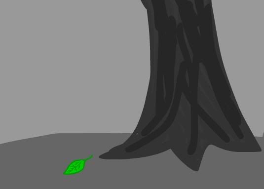
Goumas: Nice leaf. The outline around the leaf probably should have been a lot thinner. The ripples(?) are also a little thick. And this is just my opinion but I think a nice brilliant red/orange leaf instead would have been really nice.
Dudeguy(BUDDY): Uh? Is that a worm in an apple? Don't know if I would of known it to be for the Autumn theme without the title.
Marton: Odd looking trees, did you really have to copy and paste them? I would suggest practicing shading, simple cell shading really makes MS Paint pictures stand out. The sky is a shade of blue that is just to dark, maybe add clouds? Simple things could of been done to beautify your picture, and none of them take very long. And another victim to jpeg.
Nilo: Hmm, I like it. Yeah you editted it a little. Leaves are a little better. You could have put a little extra to the background. Can I ask what the little symbols on the trees mean?
Gantic: I like it. Simple. But maybe just a little to simple to win. AND, you actually took the time to make a leaf, everyone else just did circles or rectangles...
Jdogg: Cool, almost gives off one of those optical illusions. Its like a Autumn disco party.
---------------Cenere----------------
Don't know why you said "Failfailfailfailfailfailfailfail"...because I think it looks great. Nice overall detail, but what is really awesone are the colors. You just nailed the colors! I can just sense being in the woods as the sun is rising up over a cold dewy field with Canada Geese flying over. The powers of proper colors eh? JUST one thing, a distant tree line would of been nice.