Judging. Only a day later than I was planning, but with people asking for the deadline and being impatient it feels like it has been a week delayed...
Just so you know: Zophia has a lot of other stuff to do (she is really busy), especially after the -420 kid keeps being incredibly annoying when she should sleep. Thus it being me judging alone the last couple of rounds, and might continue to do so until Zophia is feeling better and has done the stuff she should.
Besides that: Judging.
Pixie won last week, as people have been sighing about, so:

I am not sure I know, or want to know what it is, but I have a feeling it is supposed to be some kind of candy/cake with desert stuff topping.
Either way, it seems a bit sketchy, and you might need to work on your lines a bit in paint (not the only one).
First place:
Bronze.

It looks quite good, and though I would not say chocolate is a dessert (rather candy, but it seems like I am the only one thing that). You colour graduates nicely, though it is a little sad the paper is acting up like it is. If you get the chance/have a decent programme for image editing, you should try playing with the brightness and contrast to make the colours deeper.
Other than that, it is a good idea, nice drawing, and the expression on the chocolate looks good.
Second place:
Crimson.

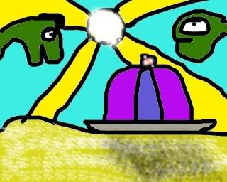
I know I seem to repeat myself when it comes to you, Crimson, but it is because it is true: You are getting really good at drawing, and the images are getting more and more complex. It could have been fun with Saquatch and Yeti in the WoM, but that is another discussion.
The highlight on the sand is a little too... Well, it seems to be white instead of a warmer kind of yellow, which makes the sand seems cold on those spots. The characters could have needed a bit of shading as well, but on the other hand, most cartoonists does not make highlights in other than eyes, and only a bit of shadow, so I guess you are excused.
All in all, it amuses me.
Third place:
Dragonball

This version is quite good, and I am glad you took the time to change it. You should possibly have made some more melting ice running down the cone, but that is not that important.
Funny idea, and it would have worked without the "Almost!".
13 images left.
Goumas

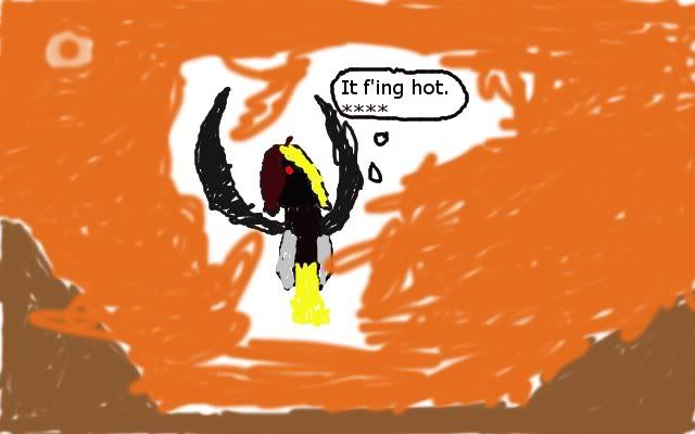
The sun is looking a little odd. Or rather, the shine/sparkles looks misplaces on the drawing. It seems you used GIMP or something similar, and those programmes have a layer function, that might help you with avoiding the white lines between the lineart and the colour.
Line thickness is another thing you might want to work on, but that is up to you.
Also, fun explanation.
Samdawg

What is that cake doing in a desert?
So close and yet so far.
Zega

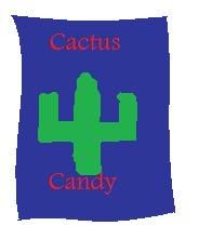
Well, if it is going to be a drunken party that cake might be a good thing, considering how people say cactus helps on hangovers. I might need to try that.
I am going to ask you the same as I did Goumas: Would it be too much trouble to work on the line thickness? It would make the drawing a lot more impressive, and it does not even have to more advanced than using a thin line for the background. You are developing your skills nicely.
RPoAG

Portal has surely manipulated our view on cakes, huh? Not so much desert, though, and the head is... grey.
The cake has white lines between the colour and the line, and the lines are a little thick. It might have worked out better if the cake was lineless too, but I am not sure. The upper image of the stickguy looks amusing due to the black line, though. Was it intentional?
Marton

Where RPoAG has dessert, you have desert. The hills are a bit abrupt in shape, but not really a problem, I guess. And yes, sand.
Dudeguy

I actually hate it more when the ice cream is melting down my hand and arm with alarming speed...
A bit perspective would make it look more natural.
GuitarHero

And I who thought Zega would object to this one.
No further comment.
Gametesta

What do you use for drawing? It does not look like paint, but then again...
Hopefully his "hands" won't melt.
Superpickle

... I have no idea...
Perslos

Rather simple... There is not really much to say other than you might thing about what colour you use for text, because when you save paint drawing in jpg format, the drawing gets a little smudgy and the text, if it has the wrong colour, will be hard to read.
Snake

Hmm, reminds me of art rage.
I am not sure if it would have worked better if you made the entire desert be made of lollipops. Somehow I thik it would have been a better idea, instead of making a desert with some random lollipops popping up for no reason.
The colours looks nice, though.
Zlith

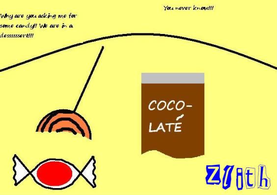
Return of the odd things people think is dessert?
Either way, I doubt anyone would want to eat it, if it acts like it would on a hot beach: Melt and then become full of sand.
The text is a bit hard to read, though.
And Owen made a nice desert to end it all with.

The lines are... odd. Would probably be fun to colour up in different colours, though. I miss that a bit.
--
Just a note: You should not take my advice seriously, if you do not care much. I am trying to help, but my experience is many does not want to be helped. So it is up to you whether or not to try it all out.
Or yell at me for being a better-knowing 'tard.
Now, theme.
Theme: Month
Deadline: 24th of August
And please try to keep the offtopic to a minimum, otherwise I might end up refusing to judge, if I have to go through 20 pages to find 8 entries...
The same goes with commenting on delay, because I am well aware of it, and I am feeling bad about it.