Forums → Art, Music, and Writing → Bronze's random Art
| 607 | 212927 |
This thread is for me to post my art, mainly drawings.
So you guys just sit back and enjoy, and please feel free to make a comment. My first piece is something I usually do to warm-up. 
Say hi to Mr. Smiley
- 607 Replies
I don't think it's the beard, it's more likely to be that deer-in-headlight expression you have.
The eyes are what I were refering to in the post above, I was just to close to the paper. Didn't realize how big they were getting.

That is a rather enjoyable drawing, that. Might have put the thicker lines the wrong places, but I do that all the time, so I am not going to complain about that.
Funny and nice and clean looking, and again something I would assume to be part of a news paper comic somehow. I don't know what it is, might just be the raw quality to your scans.
I'm not giving my photo scan secrets away! (it's actually an instagram pic taken with my ipod)
Stay tuned Cen, I'll be floody this thread with a bunch of unfinished doodles very soon to celebrate over 500 posts.
Doodles are always nice, they are much nicer to look at than finished pieces in many ways, because the line is softer and more fluid.
And then you can see the nature of the artist in their doodles, too.
Congratulations on the over 500 posts!
Agreed and thanks.
How many drawings should I post at once or on one page? Will a bunch cause problems?
No idea. Any and/or all of them.
Though there might be a need for an "image heavy" warning somewhere, if you put up more than, say... twenty 1000x670 pictures. The threads lend to image posting well, but people doesn't as much, because of their computers. If you do regular sized, it's just a matter of how much you are willing to cram into img-coding and if you are hoping to ever see a comment ever again.
Twenty-thirty seems like a good limit for doodles of a smaller size anyway, though people are more willing to comment when there is only a few and not... six or something? I don't know, peps be lazy.
But, well, technical specification is just a matter of making the images fit in size, as far as I am aware.
I'm just gonna go for a big dump then, maybe 20 images. People don't comment that often anyway.
So, meh, I haven't been really active over the passed couple of days, so I feel like I should critique/applaud your artwork.
So, the CD design seems quite decent. Is it made with paint or?
Anyhow, the people seem to blend quite nicely into the picture itself.
The bending of the trees and the fact that they are also makes it look more dark/deep-ish opposed to trees being full and upright, yknow.
Yeah; it kind of seems fitting for several bands off the top of my head.
The ink portrait looks well, I've never been one to draw faces correctly so me critiquing that would be hypocritical.
The Thanksgiving one looks quite well, somewhat simplistic yet there is a lot of detail if you look at everything individually.
I would probably add to each of that if I was in a creative mood and it wasn't approaching midnight, so, yeah..
IMAGE DUMP IS HERE
For my over 500 thread post celebration-thing, I'm going to post a bunch of doodles and unfinished drawings. I consider some of the WIPS, so look forward to seeing the finished product on the future. If you want to comment on any of them, feel free.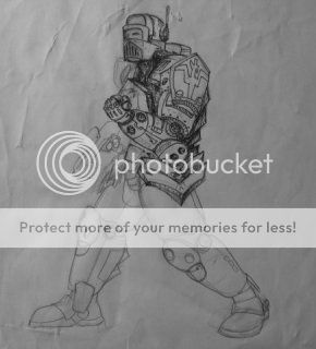


Wham!
I know these are not done, but, well. WiPs.
Halfdone power armor:
Seems well constructed and fitting, without all of the bother that seems to be with doing full suits of armor. There is a little issue with the way the line has been done, the messy shadows and slightly unclear lines does not make all of the details stand out properly, which is a bit sad. It's mainly the shadows, that might have been better to keep entirely blocked out in black, which might help the rest to stand out better. Besides, metals tend to do well with the blocked shadows, if used correctly.
Anime Horton:
That's really what it reminds me of. Kinda scary. Tusks look like a moustache. I don't know, it's just creepy. And anime Horton, which is a good thing.
Ship away:
Is that a ship or a robot? Either way, streamlined for speed, big engines for good power. Looks a bit like a beetle, with some evil eyes, which does not exactly take away from the image. If the size of a bug, it's the kind that will hit you in the face with rocket speed and leave you crumbled up in pain, because bug. It will probably fly on afterwards, again, because bug.
Shinyess is nice.
P.o.p guy.
Now with bad motion lines? Basic anatomy is good enough, stylistically it's not very interesting, but technically, besides the motion line things, it's fine.
Little doodle in corner looks like everything I do.
That's rad:
Iconic hipster look. Would do well with a steadier, thicker line and technicolours. Then it would be pretty iconic and - modern popart looking.
Beard skills are envied.
Lalalas:
Extra points for cat face. Otherwise looks like a band name/cd cover for some kind of alternate rock-punk-metal. No comment on anything else, it just looks deliciously iconic and memorable.
Armordude of olden lands:
There is something off about this, I am not quite sure what it is, but it might be proportion based. Perhaps the torso or arms look too short, perhaps it's the legs being too long for such a stocky guy. Either way, it might be a scrap and redo/trace and redo kind of thing. Mainly the latter, since it's really nice looking otherwise, and would do nice done and shaded and detailed. Besides the base issue.
Happeh:
That is me every morning. Fangs and bald and all.
Faec:
Good for caricatures, simple, displays emotions and basic character concept well, bearded dude looks pretty nifty.
More faec:
I don't know, looks like quite a work in progress. The basics seem like they should be, though hair is overly messy, even in this state. Shading on nostril looks funky somehow.
Death, now with candy:
Not quite up to your usual quality in my opinion. It's not bad, it's just really, really funky and twisted, and sadly not in a good way. Like four drawings combined. Skull is one, hood is another, hand is a third, and everything else was done in kindergarden? I don't know, it probably sounds rude.
Tarboy-granpa:
This is a nice, loose sketch, it has quite a lot of life for something - dead. A bit more detailing and a dark background, and it's the kind of robot you walk past, just as something holding it up gives, and it leans forward, scaring you forever from sleeping. Or is that just me? Anyway. Eye's a bit out, though.
Lifethingwhatisthat??:
I have no idea. But the linework is solid for the most part.
Scarecrow you say?:
same for this as the robot. Detail it, add a dark background and backlight, secondary light from below, tertiary light in red faintly from above, and then a clear eye and the knowledge you will not leave the cave ever again.
Car:
Wonky. Ordinary. I can't cars, though, so who am I to talk. Front window line seems off, however, on the passenger side, and the door doesn't match up properly.
King of the armor:
Crown seems uncomfortable, but I have never figured out to do them properly either. Unless it's made of foil, it would probably be really heavy, though. Nice sitting pose, perspective looks fine, all the power to drawing a proper chair/throne. Outfit fits and is well composed.
Shadyface:
It's shady. And sketchy.
Cottage of them banjos:
Nice quick one, the perspective is a bit off all things considered, but the concept is great and it captures the idea well. The dog looks a bit like a bear, but dogs of that size and life usually does, and, again, it fits the concept well, and the execution better.
Congrats again on the post, and may there be many more.
Woah. I got my doodles critiqued. Most of them are products of goofing around. The Grim Reaper, for example is full of my sense of humor.
Armordude of olden lands
His head is really small, that throws everything else off.
Lifethingwhatisthat
It's a cap commonly worn by soldiers in the American Civil War. I started drawing that in '07. That's how old some of them are.
The only ones that I might finish are the first one (my dog walked across it and it had a couple of holes in the paper, the car, and the last one.
Woah. I got my doodles critiqued
You uploaded them on the internet, stuff like that happens.
Accidentally.
His head is really small, that throws everything else off.
Might very well be that, indeed. Didn't look too bad, just everything else summing up to something odd.
It's a cap commonly worn by soldiers in the American Civil War. I started drawing that in '07. That's how old some of them are.
I could not see that. Looked like one of those life saver ring... things on top of something. The line comment still stands.
The only ones that I might finish are the first one (my dog walked across it and it had a couple of holes in the paper, the car, and the last one.
Seems fair. I will look forward to see those done, especially the last one. And the car, because cars are awesome and I can't draw them.
The first one as well, all things considered. It's rather impressive, messy shadows and all.
So, meh, I haven't been really active over the passed couple of days, so I feel like I should critique/applaud your artwork.
Yay! I wished everyone would be in the crit mood.
So, the CD design seems quite decent. Is it made with paint or?
Anyhow, the people seem to blend quite nicely into the picture itself.
The bending of the trees and the fact that they are also makes it look more dark/deep-ish opposed to trees being full and upright, yknow.
Yeah; it kind of seems fitting for several bands off the top of my head.
Yep, Acyrillic paint. I'm not good with painting, but I'm slowly learning. I am very happy with the trees though.
The ink portrait looks well, I've never been one to draw faces correctly so me critiquing that would be hypocritical.
Just crit it if you want, don't worry about feeling hypocritical.
I will look forward to see those done
At the rate I move, I might have half of one done in about a year or so.
It's rather impressive, messy shadows and all
I just have a thing for messy lines.
You must be logged in to post a reply!