Alright I think this might have been suggest but from the list I compiled I don't remember seeing it. So lets do this.
I go to talk on profiles and I have to scroll for like 10 seconds on my laptop to get the the comments and it's so annoying! I think if the about exceeds a certain about of lines(10 or 20 or something) then it turns into one of those boxes that scroll, don't change sizes like the comment box or the box I am writing this thread in right now. Don't know what they are called. Anyways these abouts are bothersome to be, don't know about you guys. Call me on my being a baby about 10 seconds of my life, but that adds up. Anyways if this is just me then sorry! :P
I still think the scrolly about is cleaner and easier. But I am fine with a button to go down to comments real fast. Works just as fine for my purpose! XD
I don't get why people post weapons on their about, it's called about because you want to give information about you! You shouldn't really be putting pictures of weapons on it. However, I think people should not have a limit to how much they can type on their about.
Well maybe an alternative, since some people don't want the scroll bar, is to make 'ages' on the About(same size every time just contains different stuff), however that would be a lot of pages, since people usually post 10-15 guns, however it is an option. Unless you use both, where one 'age' would be the standard About, or news, or whatever, then the next page could have all the guns and such, but it's scroll-able, and the next page could have badges and/or club banners, and so on. These pages would have little tabs to access them or something similar above or below the About's edges. How many pages would be another problem, I think it would be set to a maximum of 5, and if they're not used they are 'invisible'.
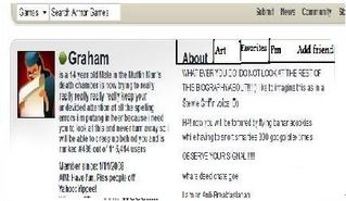
I neither yay or nay this idea really, it would be much nicer, but I think it would look really alienated, or at least stand out a lot, from the rest of the Profile. I know it wouldn't be exactly like Klaushouse's picture, but it would be similar and it just doesn't look right and doesn't fit in well I think =[
Hmm tabs is getting complicated. The button and just a scroll box are simple for coders to make but start doing this might get a little complicated for the website team. This would be a bigger update that would take a longer time to make.
Well yes, I don't know a thing about code so I didn't know it would be complicated, sorry. However it is an alternative for the future, since most people would be happy with the scrolling about, and the tabs don't have to come right away or at all =]
And yeah sorta like that Graham, I started making this before I saw your representation, so I finished it anyways and figured I'd show it since I took the time XP What they would somewhat look like(if they were on top above the About, look like. The Tabs, I mean. It doesn't have to have those names and I think, as I said before the maximum would be five or there would be too many Xo So yeah, just to get a general idea to what it would look like if they were put in.