ForumsArt, Music, and WritingArt Skills Contest

6854 5490357
Carlie
offline
Carlie
6,823 posts
Blacksmith

Hello and welcome!

This is a spin-off of the original GFX Art Battle, but with some updated rules and changes. Please make sure to read the rules before entering, since they have been modified. Good luck, we look forward to seeing some creative artistic entries!

Competition Rules
1. Must be hand drawn, either on paper or in a program. It can then be manipulated in an graphics program. But unoriginal artwork cannot be used as the main focus. Copyrighted images cannot be used. All pieces containing copyrighted images will be disqualified.
2. Submissions must follow the current theme that has been chosen by a moderator for that week. If you submit more than one piece, please clarify which one you would like to be judged.
3. If your image is larger than 600 pixels wide, please provide a link to the image instead of posting it in the forum. Otherwise, the image will be cut off.
4. Artists cannot win in subsequent weeks. You can still submit, but if you won the week before, you cannot get first place again the next week.
5. After the deadline, a moderator will pick the winner, and they will be awarded a 25 AP award.

  • 6,854 Replies
Strop
offline
Strop
10,816 posts
Bard

Finally, now all technical issues are finally out of the way!

Just before you see the results, I will explain how I go about judging these contests. Because art is a subjective thing, or at least partially so, I've taken license and since I'm the sole judge of these contests, it should be clear that I'm not pretending that I've nominated "the best" or somehow managed to rank these pieces one by one on some universal standard that may or may not exist. This is a difficulty that all open art competitions face. So you might ask "so how does strop nominate what he likes the most?"

I go with a sense of something that really jumps out and hits me, be that effect gradual or immediate. I'm looking for works that, regardless of what they do, have some kind of profound effect. If you've done this with your work, you have a good chance of winning. The best part is that it's very hard to actually do this consistently unless you have some kind of miracle magic up your sleeve, which is why I can safely say that the winner's piece won't necessarily be "the best" on any standard, but it will most certainly be striking, or special. This is why cholokid's "Chuck Norris: bringing fashion to your face" entry won last week: it was completely unexpected combined with usage of common internet lulz, done in MS Paint. It literally had me in stitches because it simply struck a chord. Not because I have a liking for Chuck Norris jokes (that would be overly biased) but because of the context of it.

Without further ado, here's the judging with my notes added. If you see the image has been cut off, click on it.

Grand Winner:Gantic

http://img.photobucket.com/albums/v226/blackcairn/Ganticambigram.gif

This was the only repeating design (I've forgotten the actual name for it but anyway), but I have to say on an immediate impression this was the piece that really stood out. From the posts I'd say a number of people agree with me. What I particularly liked about it was its subtlety- the slight color touches and the stylised but minimalist font, as well as the fact one couldn't be sure whether it was actually the name in text, or something else. This had the effecet of bringing a timeless, symbolic gravity to the piece, but at the same time showing, not telling.

Congratulations, Gantic, you've earnt yourself a merit! Just message me saying so and I'll handle the rest.

2nd place: dank

http://img183.imageshack.us/img183/5702/44100059yb6.jpg

Deciding between 1st and 2nd was a very difficult decision. Both Gantic and dank's designs had a certain elegance and compositional grace to it. Note how I said design, which was the hint I dropped earlier in the week. It has a meaning distinct from artistry and representation but at the same time involves various aspects of them- and in this case there was also a certain symbolic significance, if somewhat abstract, brought out by the contrast in dank's entry. I thought it was absolutely ingenious and also a great piece of vector art. Again, there was, to my mind, very little separating 1st and 2nd and it was simply a difficult decision that I had to make, and I only hope that dank will continue to enter in the future. In fact, I am considering bringing up the possibility of awarding more than one merit per round on the basis of standards.

3rd place: Zophia

http://i193.photobucket.com/albums/z121/Mazzelh/Zophiamazzelhs-smallview.jpg

Even if Zophia is already a well established contender who "always" places highly in these contests, I've chosen to this piece because I was extremely impressed with what went into it. As Zophia has pointed out, this is a merging of every visual style that she uses, both traditional and digital media. The execution is tremendously smooth and does a fine job of encapsulating that which we know as Zophia (in the form of green fuzzballs), and this kind of presentation is something I consider to be entirely unique to AG. On the flipside, as an artist myself I know that sometimes a piece has more put into it than it seems, and I'd say this is one of them: the significance of this piece is not recognised unless by the trained eye, so its audience impact is somewhat restricted. In this manner, you could say it is the antithesis of the entries mentioned above.

Now...there were a large number of entries, so instead of ranking them all in order, I'm going to go through them in order of appearance in the thread, listing the honors as I go. With the exception of the dishonorable mention. Yes, there is one this week, kekeke >

Firetail Madness

http://i317.photobucket.com/albums/mm362/Tetimaru/Firetail_MadnessIMPACT.jpg

There were a large number of themed entries, because there are a large number of themed AG usernames! Firetail Madness' is a very good example of such, but I particularly liked the random fleeing pacman!

FST6

http://i209.photobucket.com/albums/bb19/fst6/fst6-3.jpg

Unfortunately, poor FST6 was left high and dry because his name was actually random and he couldn't figure out what to do with it! In the same breath I could mention mentorso123, who had the same predicament. However, I can think of something for mentorso...have you ever heard of the sweets called mentos?

Cholokid- also contender for The Entry That Made Me Go "Whut?"

http://i534.photobucket.com/albums/ee348/Cholokid34/name.jpg

I honestly had no idea what this was for a while but it got a giggle out of me. Cholokid later explained that the guy was running away from Chuck Norris. But I did say that consecutive Chuck Norris jokes wouldn't work on me!

Estel

http://i348.photobucket.com/albums/q323/Estel_03/KING-1.jpg

Estel's entry seems to have taken a slightly more textual approach to conveying the name, further adding "king of man" and backing this with a regal blend of green and shining metallic silver. I'm not sure what's in the background but perhaps this is part of the effect, since to me I see a world map.

Crimsonblade55- "Most Literal Entry"

http://i530.photobucket.com/albums/dd349/crimsonblade55/signature-1.jpg

This would go very well as a logo, or even a signature image, were it to be made parallel (or even magnified and cropped so the "engraving" looks like an inset). The only way crimsonblade55 could have made it any more literal would have been to draw 55 blades but...well I'm glad he didn't!

LonLonRanch- "Most Epilepsy Inducing Entry"

http://www.thebanditsociety.com/misc/name.jpg

By which I mean it was possibly the strongest blend of vivid colors of the entries here. This was also a humorous contender for the dishonorable mention because it flaunted the theme for this contest in just about every way, with a picture that had no apparent relation to the theme and then a blatant acknowledgement of this by plastering a great big <Your Name Here> across it. No, I don't think you forgot anything at all, LonLonRanch xD

plokkey- "Most Random Lulz"

http://i341.photobucket.com/albums/o378/mopkey/Art%20Entries/BG.png

The criticisms that certain parts ended up blurred that possibly shouldn't have been seem on the mark, and at this point while I'm not going to single out any one person I must raise the issue of the agony of thinking about what kind of effects add to and what detract from your work. This is simply a reminder as it's highly discretionary, and I know I often create multiple versions of a picture if I think I might like something at some times but something else at others. But the way this did work for the entry was with the "-mon" at the end...that just made me laugh.

apocalypse- Highly Commended

http://i496.photobucket.com/albums/rr321/Apocalypse_ArmorGames/untitled-1-1.jpg

Make no mistake about it, if I were to nominate a 4th place, it would be a tight contest but this would be right in it. Everything seems to work in its favor- the dark, musty color scheme, the foreboding font and even the abbreviation to "APOC", the multiple words crowding up the screen. This is a piece that truly seems to herald a coming apocalypse...and letters shall rain down on your head from the sky and drown you in an ocean of verbiage!!!

No, seriously, it's very good.

strop- by yours truly

http://i438.photobucket.com/albums/qq105/strawpony/stropwn.jpg

I don't actually expect to get a laugh out of this but it is a bit of an in-joke. I'm allowed to laugh at my own jokes, aren't I? 8D

cenere- Highly Commended

http://i428.photobucket.com/albums/qq1/Cerene_Cerine/cen-1.jpg

(this is the small version)

It was refreshing to learn of the meaning behind the name, and I could plainly see intention in the execution. Having attempted to use charcoals myself, I know the irony in how difficult it is to actually portray ash in a medium composed of essentially the same thing! The other reason I found this favorable was the combination of minimalism and therefore thematic harmony, and so this would be the other contender for 4th place!

Also Cenere did another sketch which I actually found very cute. There is nothing wrong with shoujo girls! You only have a right to feel dirty if you somehow publicly post ecchi :P

pedspog- "Impressive First Effort Award"

http://i407.photobucket.com/albums/pp151/Pedspog/PedsBG2-1.png

Pedspog appears on the scene with a gritty tribal theme, complete with color gradients and a hard hitting color palette. Now that we've informed him about transparency and the multiply brush setting, I hope to see much awesome from this contestant in the future!

...

And last, but not least, the Dishonorable Mention which goes to...KingRyan.

I dare you to click it

The real reason KingRyan gets the dreaded DM this week is because he called me a Victorian Bogan. But I'll also add that his entry was taking the piss out of the advertisements that you see at the top of AG sometimes. SERIOUSLY THOSE ADS GENERATE REVENUE THAT HELP THIS SITE RUN D: or something like that.

This week, the forfeit for the dishonorable mention is that KingRyan has to post, on my messenger, a retraction of the accusation that I am "a Victorian Bogan", and further add that he is in fact "A Southie Bogan", or be shunned.

Shunnnnnnnnnnnn!

And that's it for the judging, folks! Thank you all for entering, it only took me a full hour to type all this! I shall reveal the next theme shortly!

Strop
offline
Strop
10,816 posts
Bard

Nuts, I forgot to link to firetail's entry because it got cropped.

Here you go

Strop
offline
Strop
10,816 posts
Bard

...are you ready for a new theme?

Sure you are.

Are you going to ignore the fact I just triple posted?

Sure you are! At least you better c.c

Anyway!

...

Enough dallying.

NEW THEME TIME

This week's theme shall be: Hair
Deadline: Friday October 24th

HAVE AT IT!

Strop
offline
Strop
10,816 posts
Bard

Oh look what the heck, I'll kick you guys off.

This entry doesn't qualify since I actually did it yesterday, but since I don't enter, it doesn't matter.

http://i438.photobucket.com/albums/qq105/strawpony/matsushiro.jpg

I didn't actually intend to draw Matsushiro Ken from Yakitate!! Japan but a friend of mine was visiting yesterday, and playing with my tablet by drawing lots of funny faces with big curly hair-dos. So I caught afro fever and ended up doing this.

Now, just a note before everything gets underway and this is a very important note: If you've seen Iron Chef (not Iron Chef America...no offense but it's crap lol...watch the Japanese version. It is pure awesome on TV.)

Anyway, if you've seen Iron Chef, you may note that the judging criteria is "the dishes that best articulate the theme". Think about what this means, and armed with that consideration, go forth!

shermzx
offline
shermzx
564 posts
Nomad

hair..
anyways,for the repeating image thing,did you meant repetition?

shermzx
offline
shermzx
564 posts
Nomad

ooo hair..
suggestive.haaha
sry for double post!
and!one more to 400post!!(:

Girl_Power
offline
Girl_Power
379 posts
Peasant

I have gotta say congrats Gantic it was fantstic you deserved to win.

kingryan
offline
kingryan
4,196 posts
Farmer

As soon as you said there was a dishonourable mention...I knew it was me...

So what....I have to admit I am a 'Southie Bogan' and say that you are a not a 'Victorian Bogan?' You called me an Adelaide Bogan in the first place...and that was just revenge!

So therefore, I am only going to say that you are not a Victorian Bogan if you say I am not an Adelaide of Southie Bogan!

Taking the mickey out of ads? What kind of excuse is that! You gave me that mention for the fact of me calling you a bogan!

KingRyan

shermzx
offline
shermzx
564 posts
Nomad

what's bogan?or victorian borgan?

shermzx
offline
shermzx
564 posts
Nomad

what's bogan/victorian bogan?
clarify?

kingryan
offline
kingryan
4,196 posts
Farmer

Hahaha! Well....Basically (Strop will get grumpier at me for this!) Bogan and Victorian mean the same thing!

Technically, a Bogan is someone who came from the Aboriginal Tribe called the Bogas. However, this has turned into a derogatory word which is used for insults.

In Victoria there is a place called Lake Boga (Which coincidentally is dry). The people who live there are Lake Bogans, and therefore although Strop does not live there, he lives in the same state therefore he is a bogan.

Oooh...I am going to be in so much trouble!

KingRyan

shermzx
offline
shermzx
564 posts
Nomad

lol
so if you lived in america,you'll be called a red indian.
if you live in china,you will be called a farmer?
and if you live in a singapore,you will be a orang laut.lol!

kingryan
offline
kingryan
4,196 posts
Farmer

Err....not really...

It is just a slang word in Australia. Similar to the word 'minda,' which came from a disability home called 'Minda.' People use it to call someone stupid.

I think that might just in South Australia, where there are no Bogans!

KingRyan

shermzx
offline
shermzx
564 posts
Nomad

Bogan..
aborigine..
hmmm
if i'm not wrong,there's a kung! bushman tribe.
which country they originate from?any idea?
my guess is africa.

Kingy
offline
Kingy
251 posts
Nomad

Well congratulations Gantic another merit for your fantastic stock of them.And Strop thats nice an afro lol hair would be tough I wonder will someone do a mohawk.
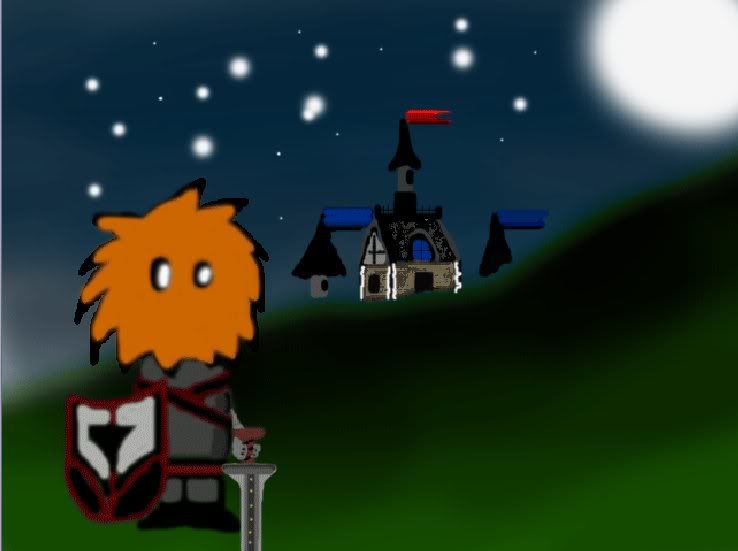
Showing 571-585 of 6854